I didn't really think a shallow depth of field looked good without the other composition elements, so it was kind of in two pictures, out of the three I have (because I didn't really get shallow depth of field without the other things)
.jpeg)
.jpeg)
I think the first image is definitely the strongest, because the other two pennies give a nice sense of depth. The third image would have been the strongest if the background were not so textured; that could have been done with more distance between subject and background to blur the table a little bit. I also like the second one, but I think the angle is nearly too dramatic.
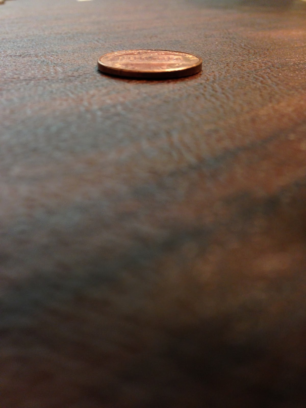
I really like the color scheme of these photos. The first photo would have better I movement if the first coin were the one in focus. As to the second photos, I feel the unusual perspective is actually really cool and interesting. I think if the tight focus had been on the front edge of the coin, rather than the back, you would like it better. And I actually really like the texture and reflectiveness of the surface for the rule of thirds photo. Kind of makes it feel a bit on the surreal side for me. . . like something floating on water. It's possible we have different tastes. :)
ReplyDelete